Skip to content

Babović
Visual Identity
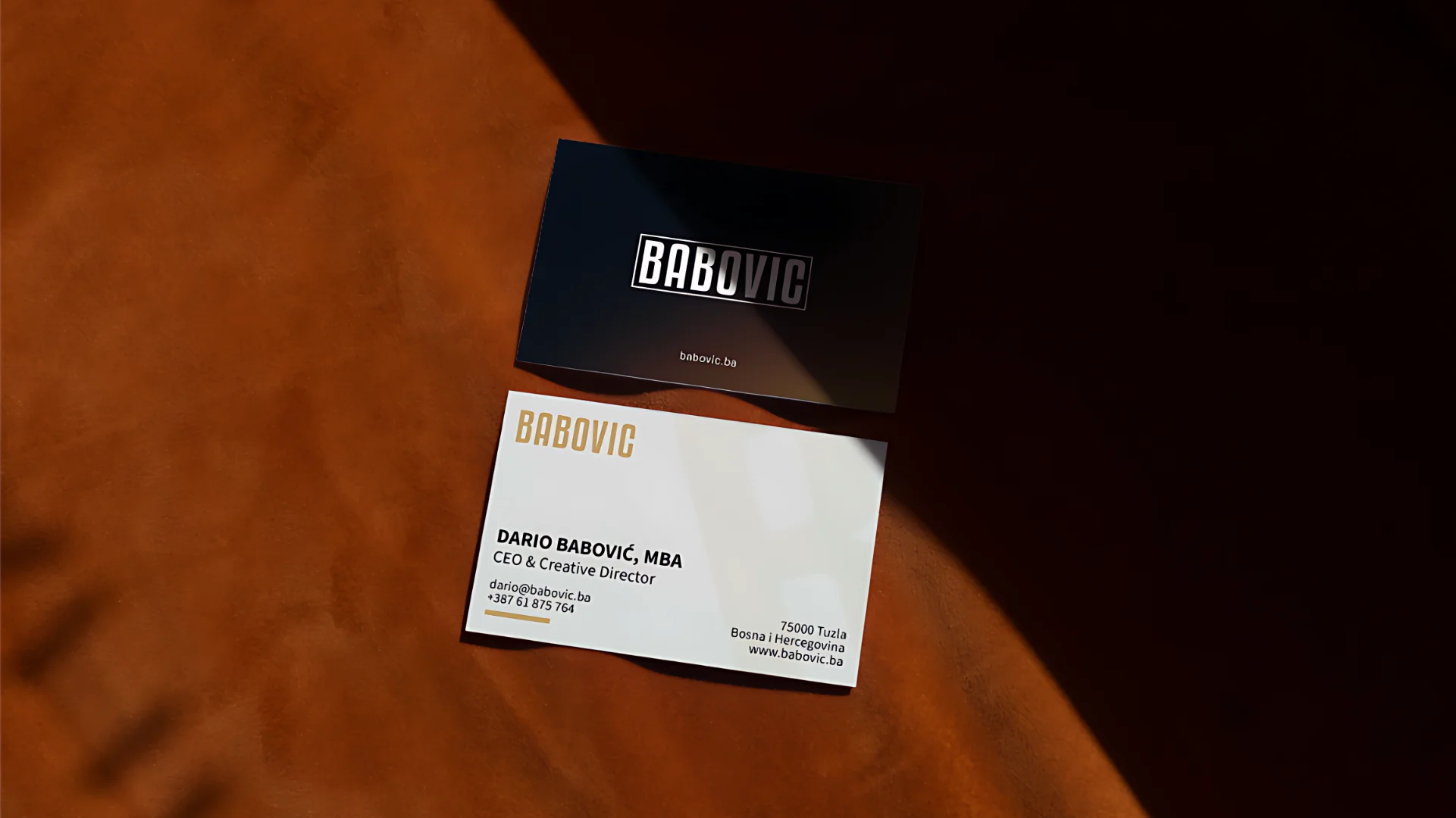

Logo, Visual identity, web design and develpment

The Brief

Babović d.o.o. is a Tuzla-based consulting and design agency that bridges two disciplines rarely found under the same roof: business strategy and visual communication. The founding team brings together a business analyst and a creative director — a combination that demanded an identity that felt equally strategic and creative.

The brand needed to work across B2B consulting, NGO/EU project work, and creative services — without looking like a generic agency or a boutique studio. It had to be confident, professional, and warm without being corporate-cold.

Challenge

Designing for Yourself

Designing your own identity is the hardest brief you’ll ever take. There’s no client to keep you honest, no deadline to force a decision, and no one to tell you when you’ve gone too far, or not far enough.

The temptation is to demonstrate everything you can do. The discipline is knowing what not to show. The identity needed to communicate expertise without self-promotion, ambition without overreach, and personality without noise.

Process

Logo Explorations

Seven directions were developed before converging on a final system. Each explored a different facet of the brand positioning.

Badge / Seal

Circular stamp with description. Classic craft heritage feel.

DISCARDED

Bare Wordmark

Condensed bold type, no container. Maximum directness.

RETAINED

Framed Wordmark

Rectangle border adds structure and precision to the type.

RETAINED

"B." Monogram

Minimal icon mark. Works at small scales as a standalone symbol.

RETAINED

Blackletter Ligature

Custom script B+B monogram. Strong but niche — too editorial.

DISCARDED

Vintage Nameplate

Arched banner with tagline. Evokes craft tradition, but dated.

DISCARDED
Decision

Why the Rectangle Works

The framed wordmark became the primary mark, and the reasoning was functional, not aesthetic. A rectangle border around the name does several things simultaneously: it creates containment (a consulting mindset – defined scope, clear deliverables), it gives the wordmark a consistent bounding box across applications, and it signals precision without ornamentation.

The “B.” monogram in a square frame becomes the icon variant, usable as a favicon, profile picture, or stamp at any size where the full wordmark would be illegible.

Brand System

Colour, Type & Tone

Professional, warm, and direct. The brand speaks with authority but without arrogance — it knows its field and doesn’t feel the need to prove it. Short declarative sentences. No jargon. Always specific over general.
Colour Palette
Typography

Web Design & Development

Building the Digital Home

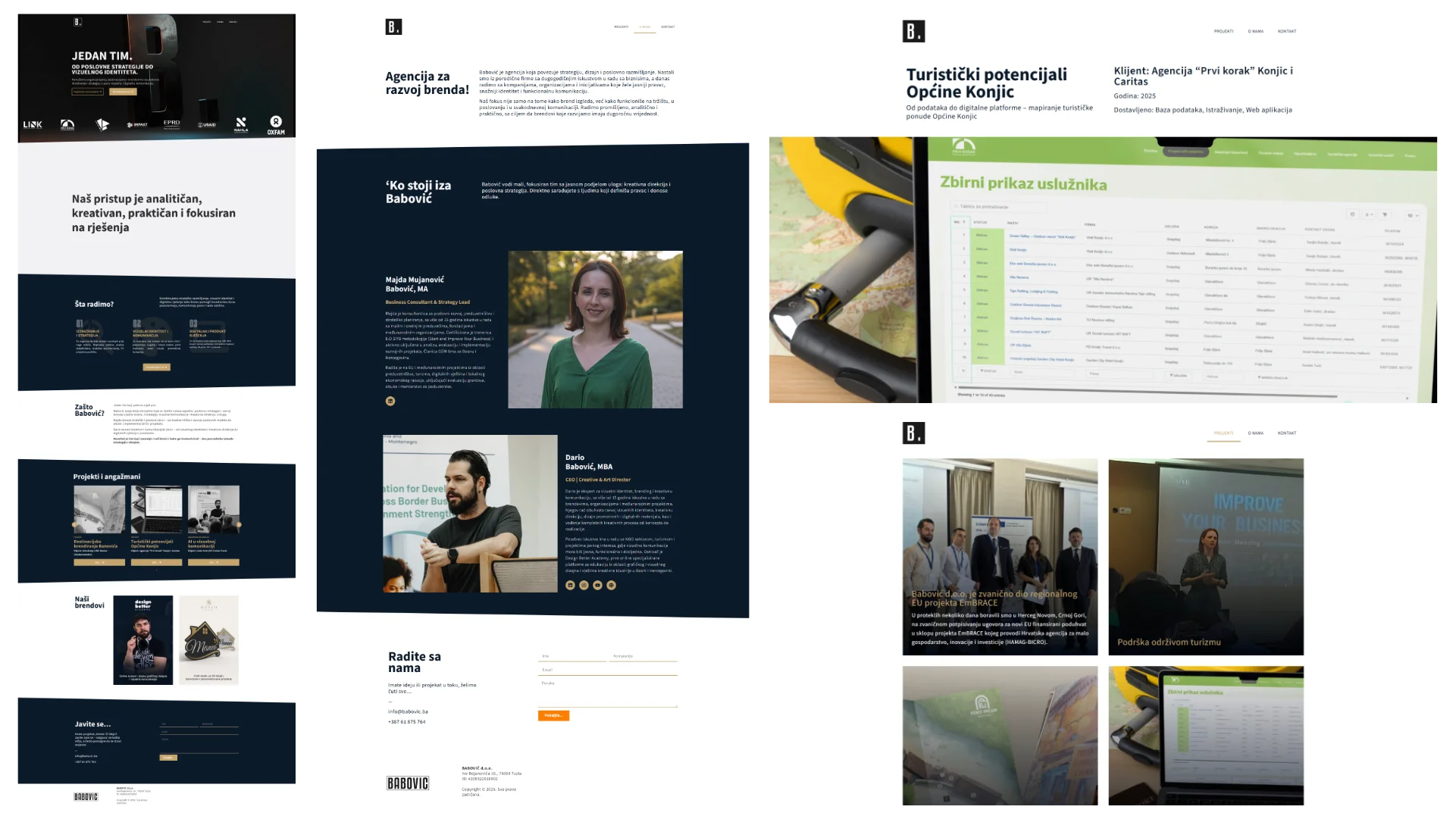
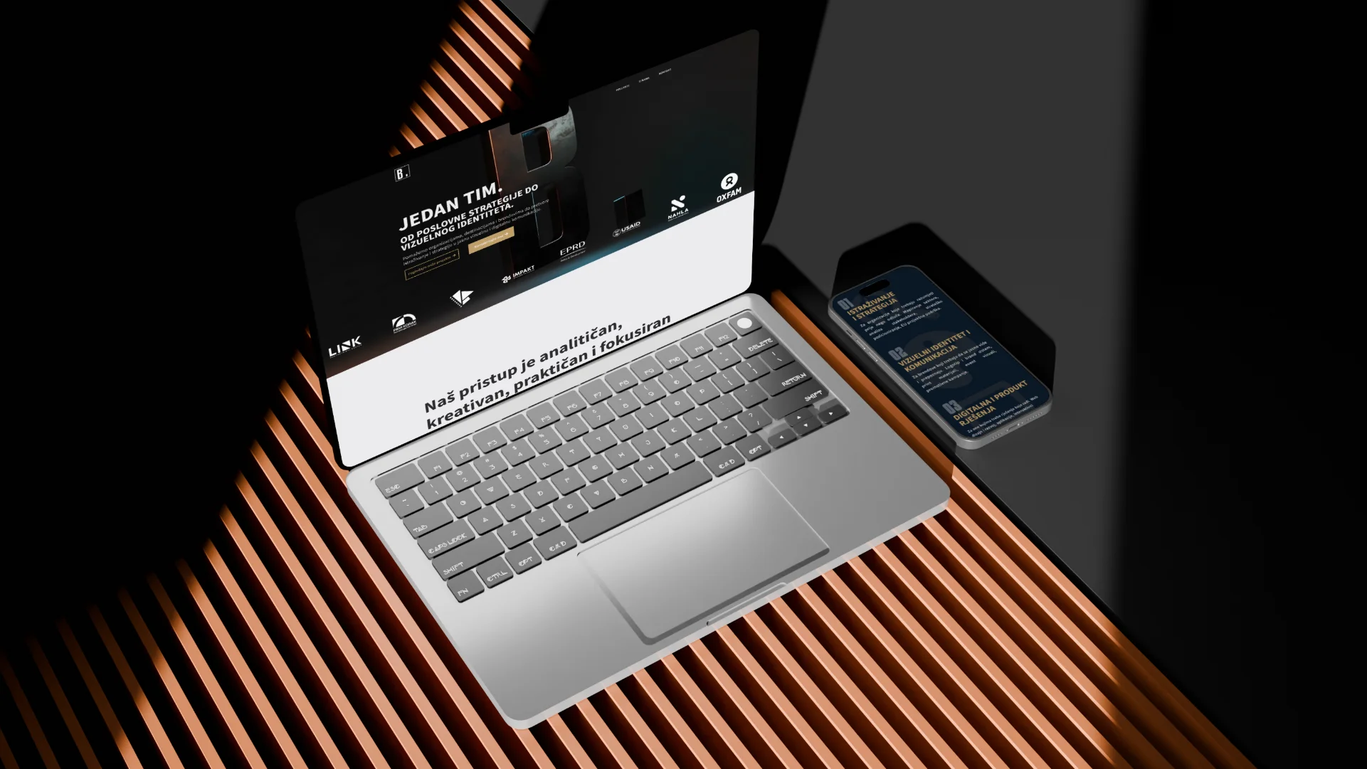
The website at babovic.ba was designed and developed in-house — a natural extension of the visual identity system into the digital space. Built on WordPress with Elementor, the site needed to do something harder than just look good: it had to simultaneously convince a corporate procurement manager and an NGO programme officer that Babović was the right partner for them.

That dual audience problem, B2B consulting on one hand, creative/NGO sector on the other, shaped every structural and visual decision on the site

Dario Babovic © 2025 , Tuzla – BiH

Envelope Instagram Youtube Facebook Linkedin