Skip to content

Design Better

Logo, Visual identity, Visual Production, web design and develpment

One designer, one platform, one market gap.

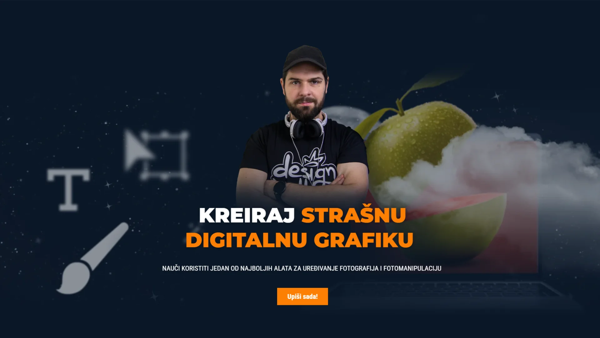
Design Better Academy (DBA) , known locally as Dizajniraj Bolje, is the only design education platform in the Bosnian/Croatian/Serbian-speaking region offering a structured curriculum from first principles through professional development. The platform needed a visual identity and web presence that could carry the full weight of that claim: authoritative, distinctly contemporary, and built to scale from individual courses to a multi-tier mentorship ecosystem.

The challenge

Imposing discipline on yourself is harder than any client brief.

When the designer and the client are the same person, the biggest risk is never having to say no. Without an external brief to push against, every idea is “valid,” every direction is “worth exploring,” and the project expands until it loses coherence.

The design challenge here was fundamentally a strategic one: define the brand’s non-negotiable constraints first, then design within them, not the other way around. Authority without warmth becomes cold. Accessibility without structure becomes noise. The system had to hold both.

Brand strategy

Authority through clarity.

DBA positions itself as the definitive voice for design education in its language market, not a softened “learn at your own pace” platform, but a structured environment led by a practitioner with 20 years of real-world experience. The brand needed to reflect that directness.

Premium, not elitist.

The visual language signals quality and seriousness without becoming inaccessible to a beginner deciding whether design is for them.

One practitioner, one voice.

The brand carries Dario's identity: the face, the tone, the 20-year track record, without leaning on personal branding clichés.

Education that doesn't look like education.

The visual system deliberately avoids the soft-colour, hand-drawn aesthetic common to online courses. DBA looks like a design studio, because it teaches you to think like one.


Visual identity

A palette with built-in tension.

"The best logos don't explain — they declare."

- D.
Colour System
 
The colour system is built around a deliberate contrast: the authority of deep navy against the energy of burnt orange. Dark backgrounds establish depth and credibility. The orange, not the safe brand, orange of corporate manuals, but a genuinely charged, high-temperature hue – carries urgency, action, and momentum.
Logo / Wordmark
 

The logotype exists in two language variants – English (Design Better Academy) and Bosnian/Croatian (Dizajniraj Bolje) – both delivered as wordmarks.

This bilingual discipline ensures the brand reads consistently across every market touchpoint without requiring a separate identity system.

Typography
 
Typography is kept intentional and minimal: a single display family for headlines that carries authority without stiffness, paired with a clean, neutral body face that keeps long-form educational content scannable. The type system is the same across all brand touchpoints — digital, print, social.

Web design

Structure as a teaching tool.

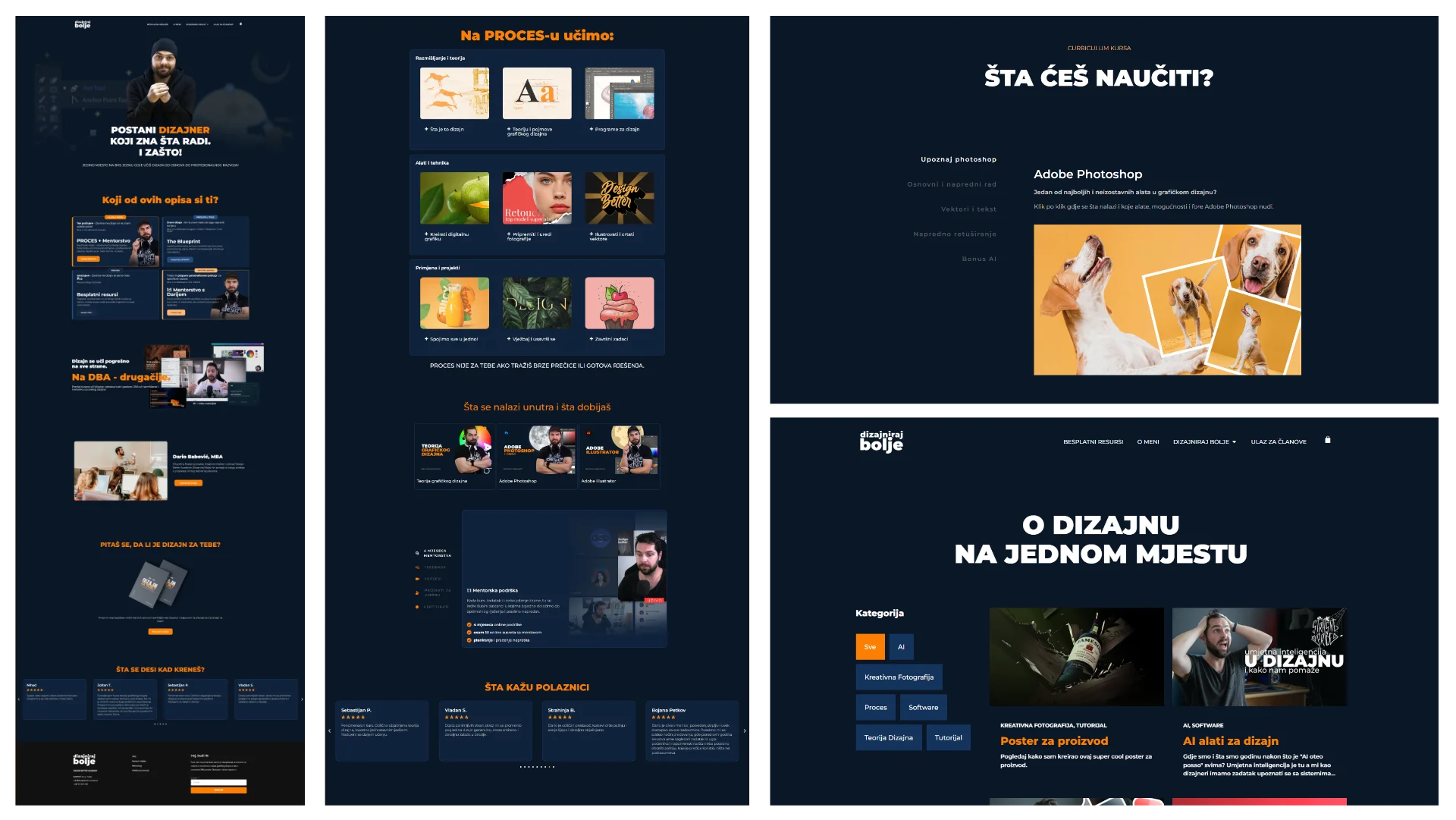
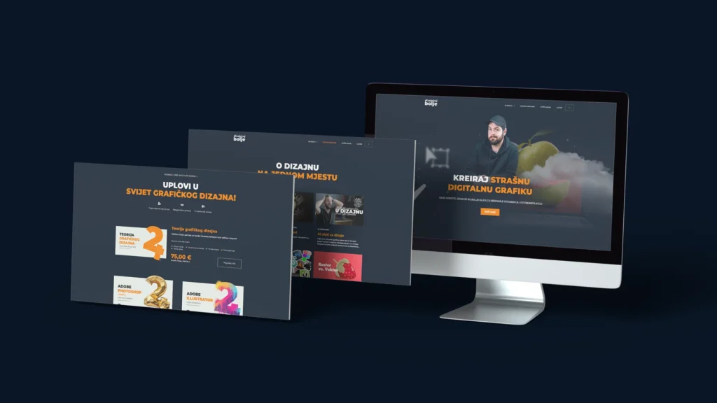
The site architecture maps directly to the learner journey. Three distinct entry points — complete beginner, intermediate designer, and someone simply exploring — are surfaced within the first scroll, each routing to its corresponding product tier. This isn’t just UX convenience; it’s the brand’s core thesis made navigable: DBA knows exactly who its students are and meets each of them where they stand.

The dark, spacious aesthetic of the public-facing site creates a clear visual register, serious, considered, worth paying attention to. Course pages shift towards greater information density as the user signals intent. Member areas are functional and distraction-free, prioritising the learning content over the brand.

Dario Babovic © 2025 , Tuzla – BiH

Envelope Instagram Youtube Facebook Linkedin