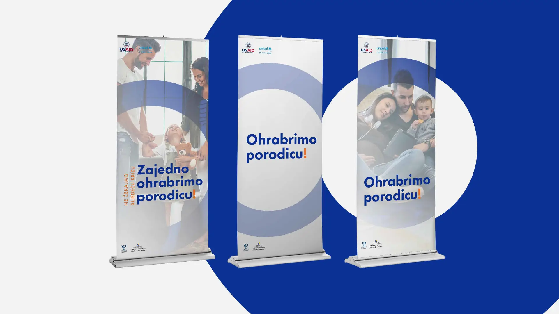
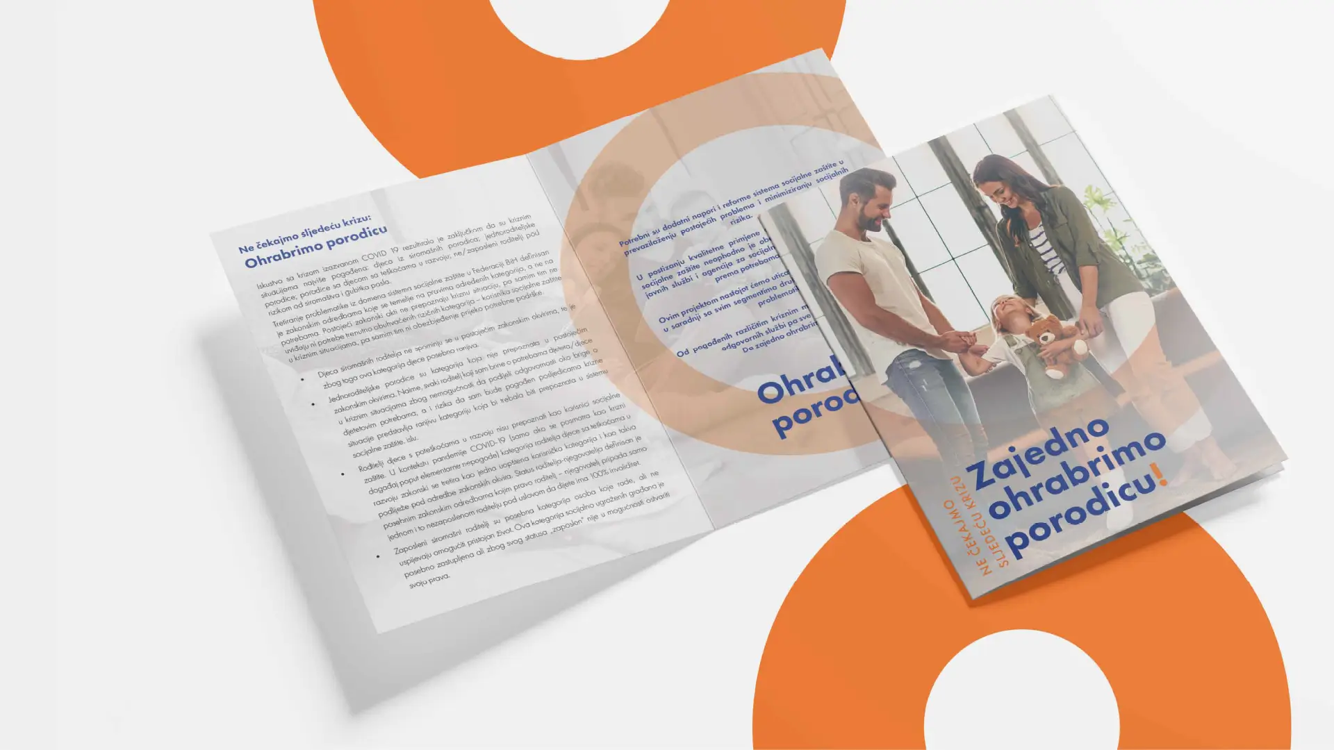
Visual direction
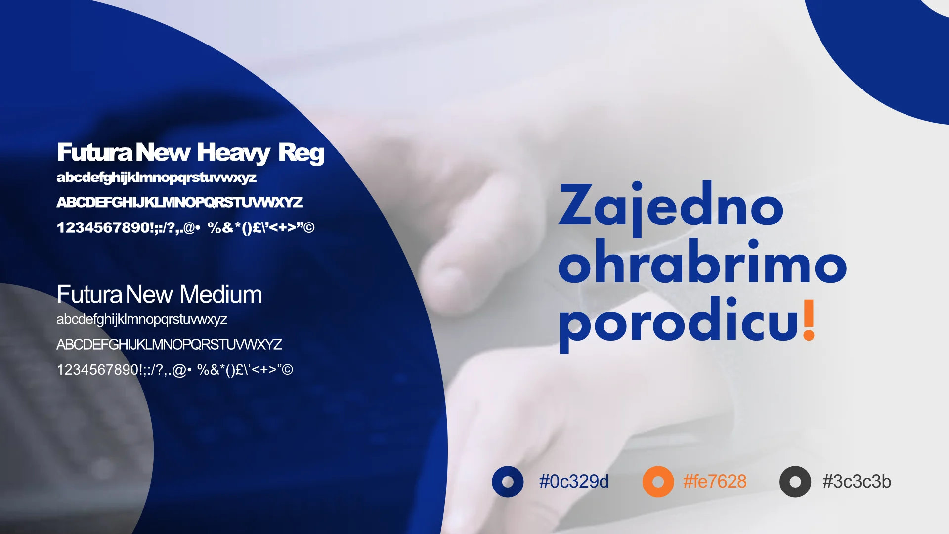
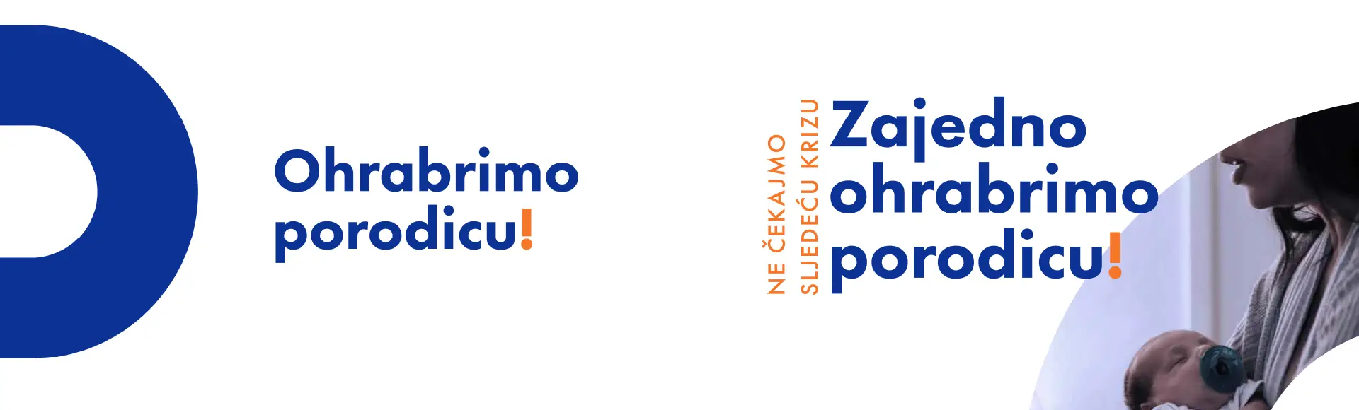
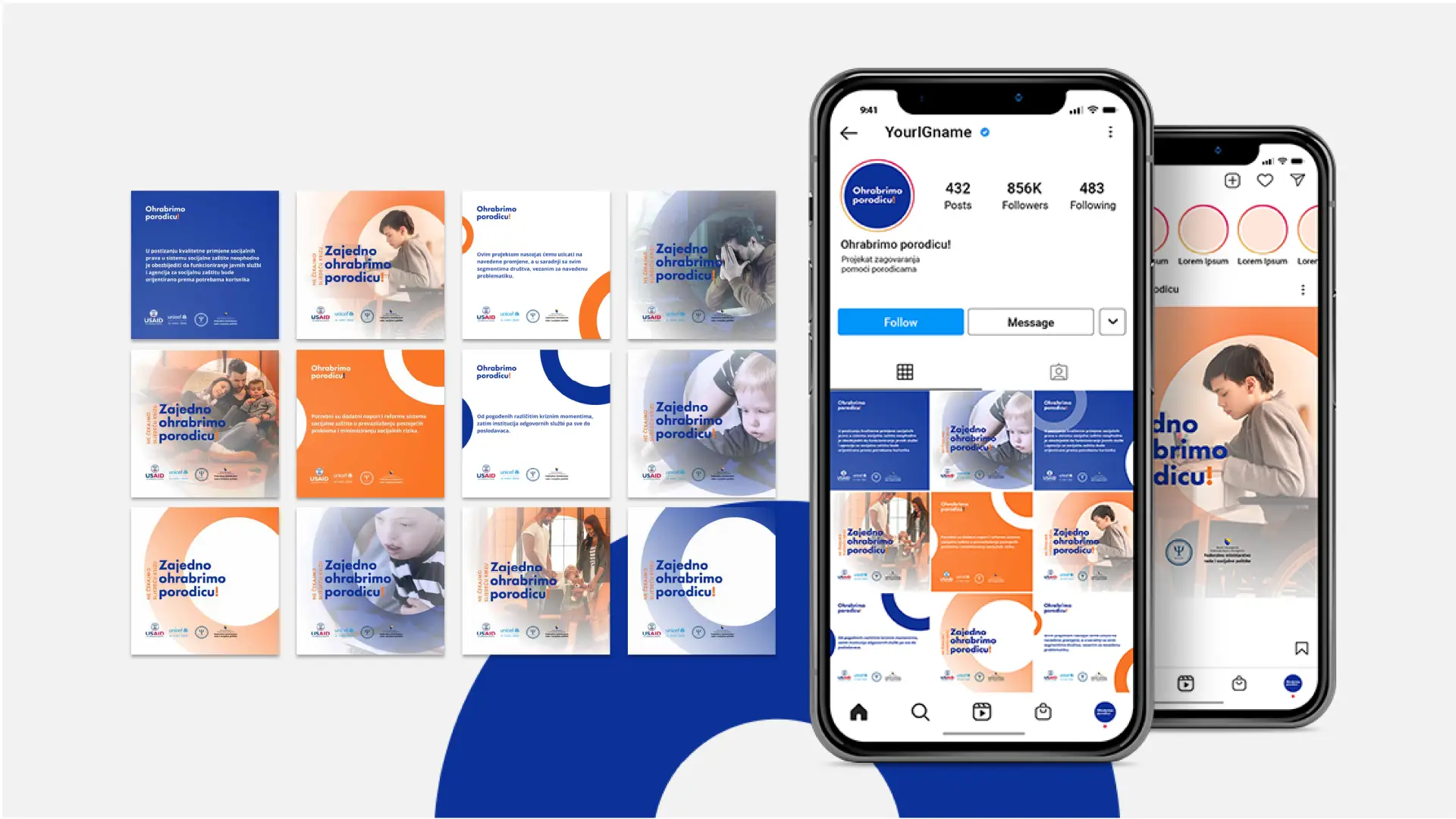
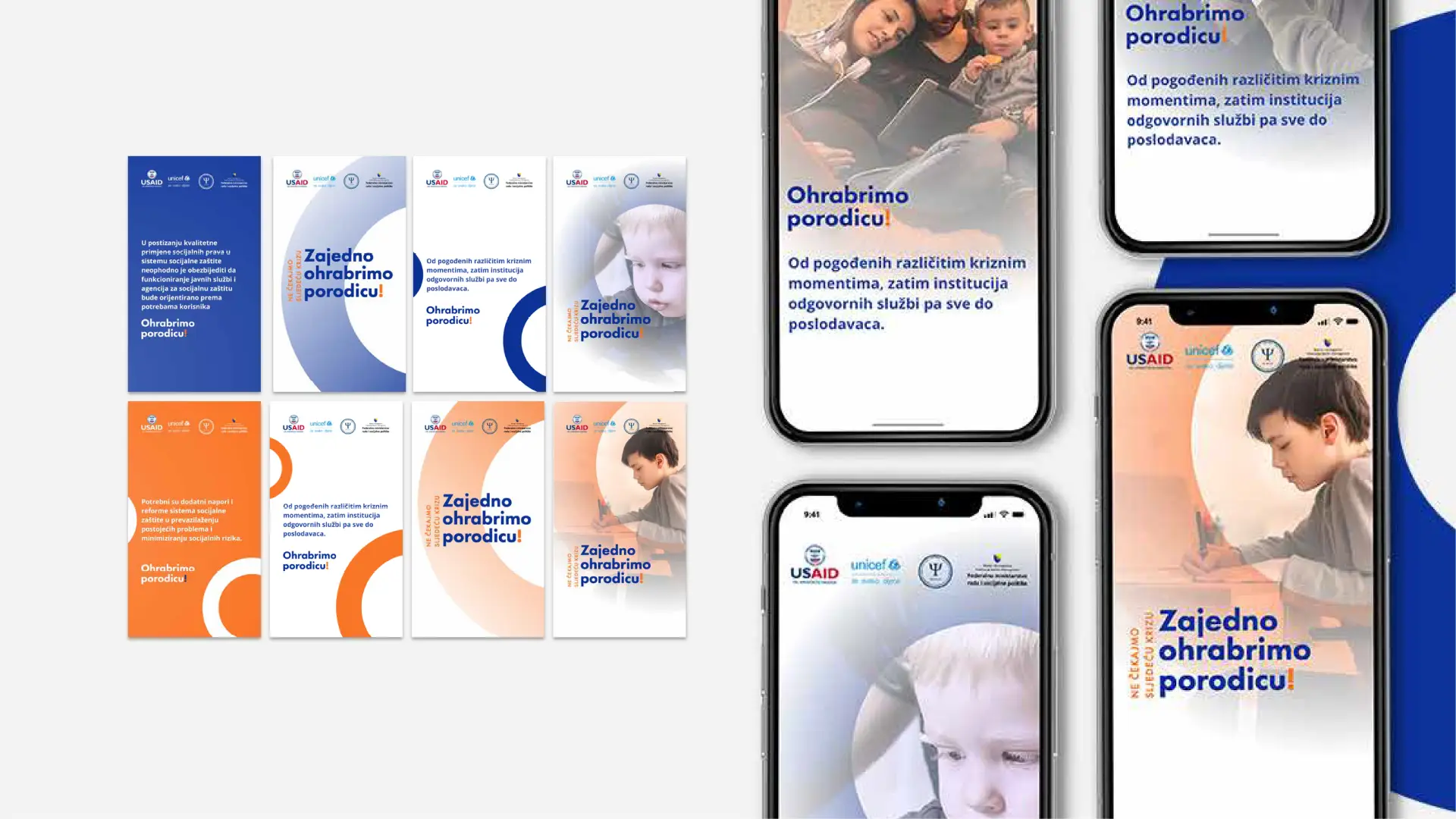
The identity centres on a bold circular motif, a form that references unity, protection, and continuity, deployed across both digital and physical surfaces. The system pairs deep navy (#0c329d) as the dominant ground with a high-energy orange (#fe7628) accent that signals warmth and urgency without clinical coldness. Photography of real families was integrated directly into the graphic shapes, keeping the campaign human while remaining structured.
Typography was set in a heavy rounded Futura sans — large, confident, and accessible to a broad public audience. The exclamation mark in the campaign title “Ohrabrimo porodicu!” was rendered in orange across all applications, acting as a consistent visual signature.